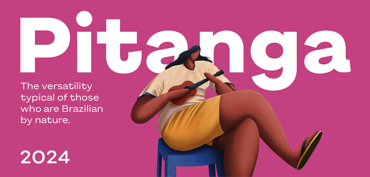
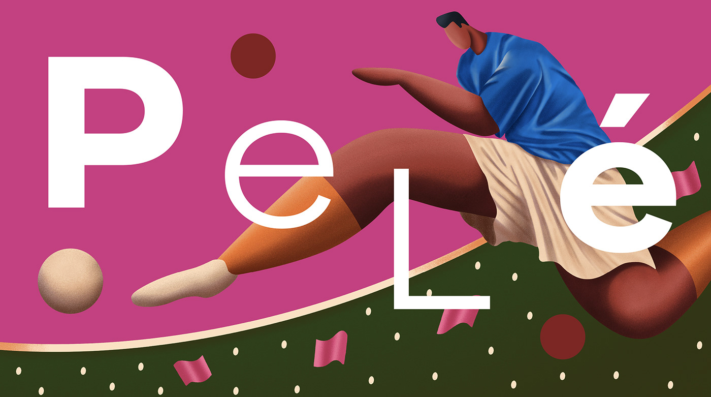


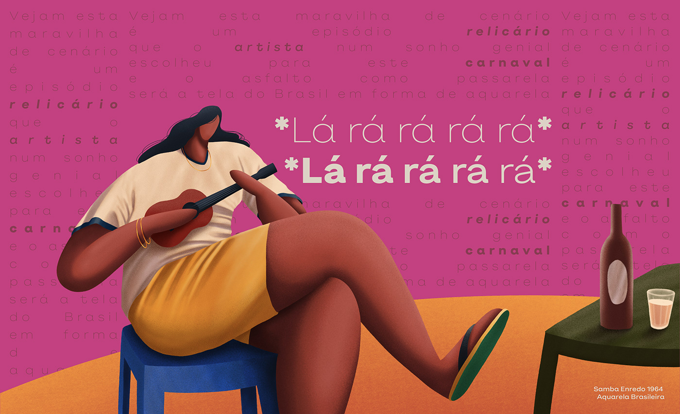


Imagine a Brazil that can only be visited between the lines, with an identity that manifests in unpredictable ways. In the footballer’s twisted leg, in the sudden improvisation, in the softness of Bossa, and in the infinity of colors, shapes, and expressions that make up this reliquary of peoples and cultures.
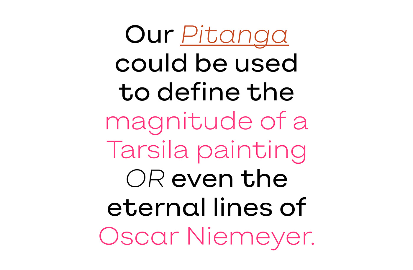
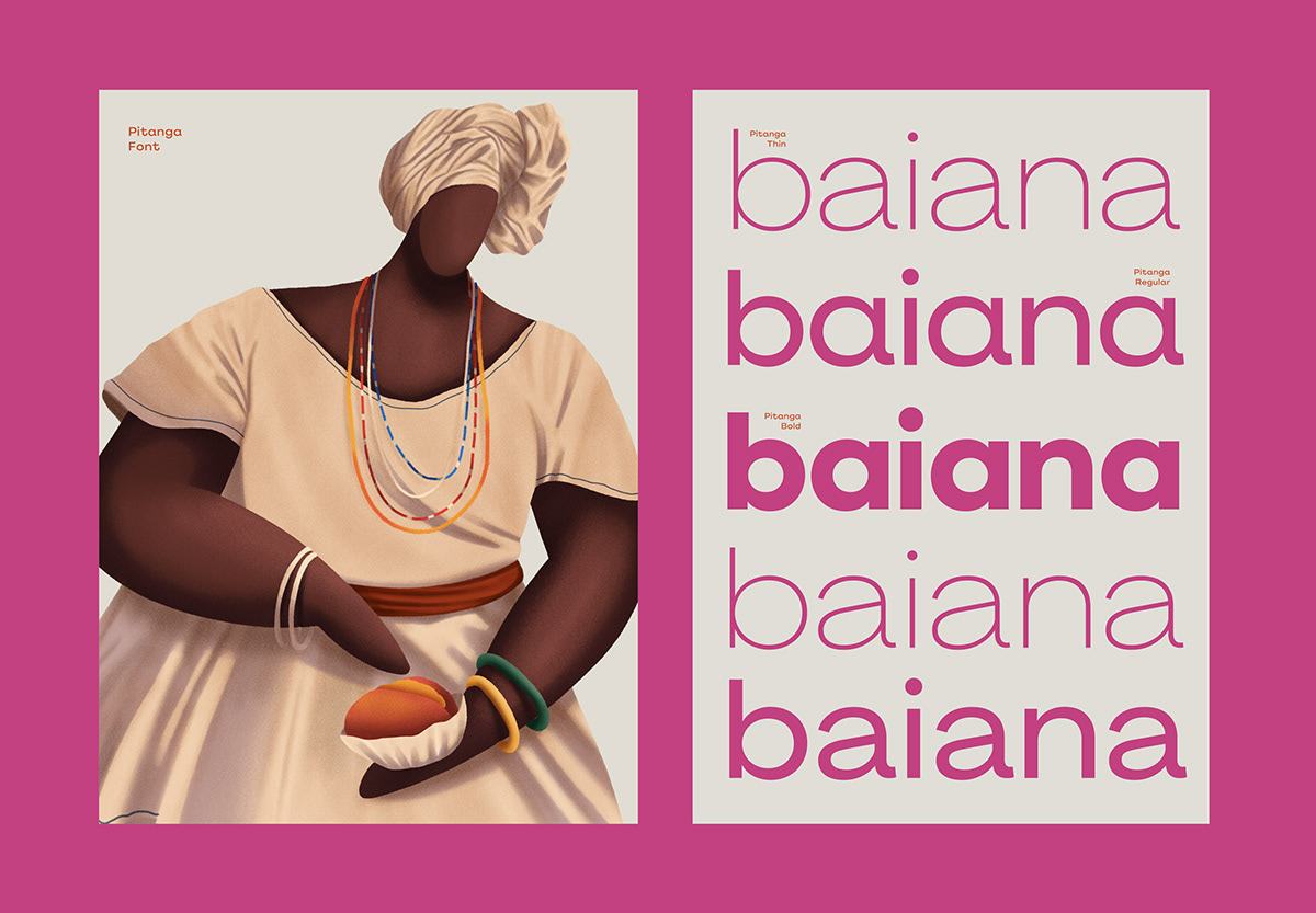
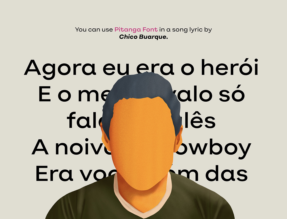
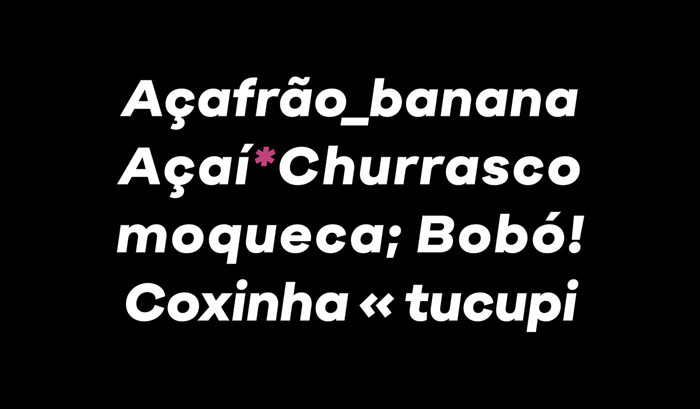
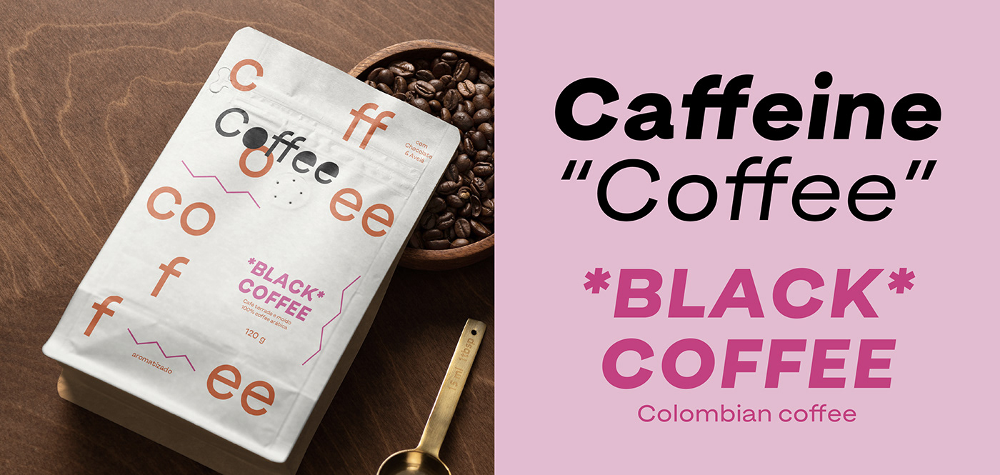
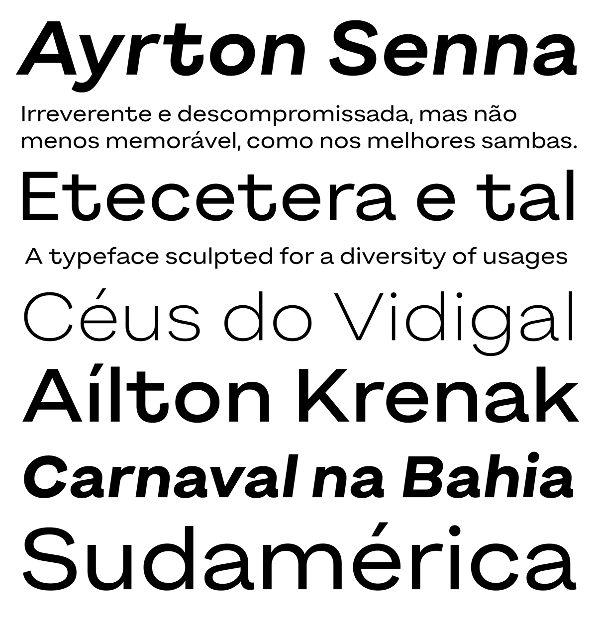
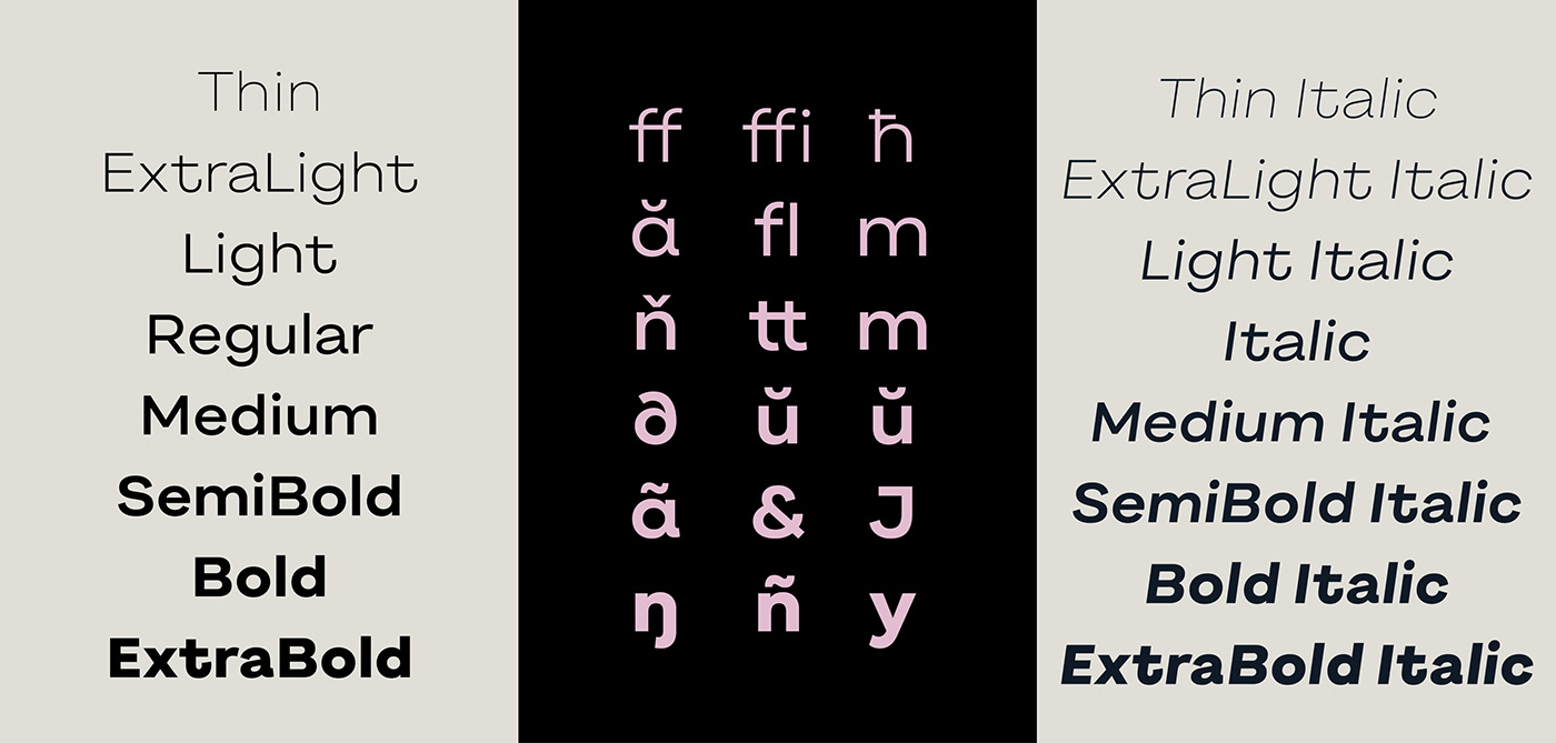
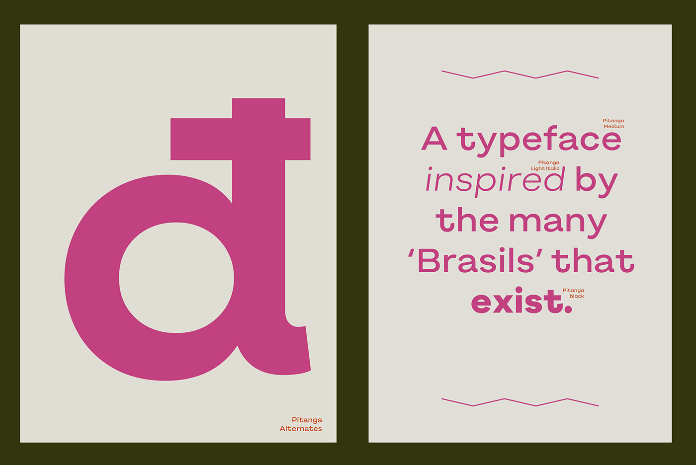
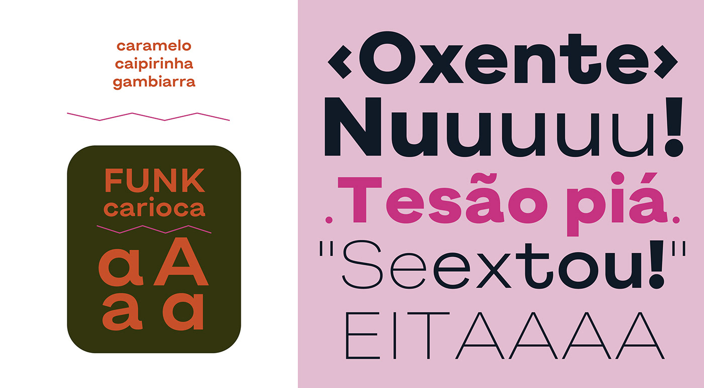
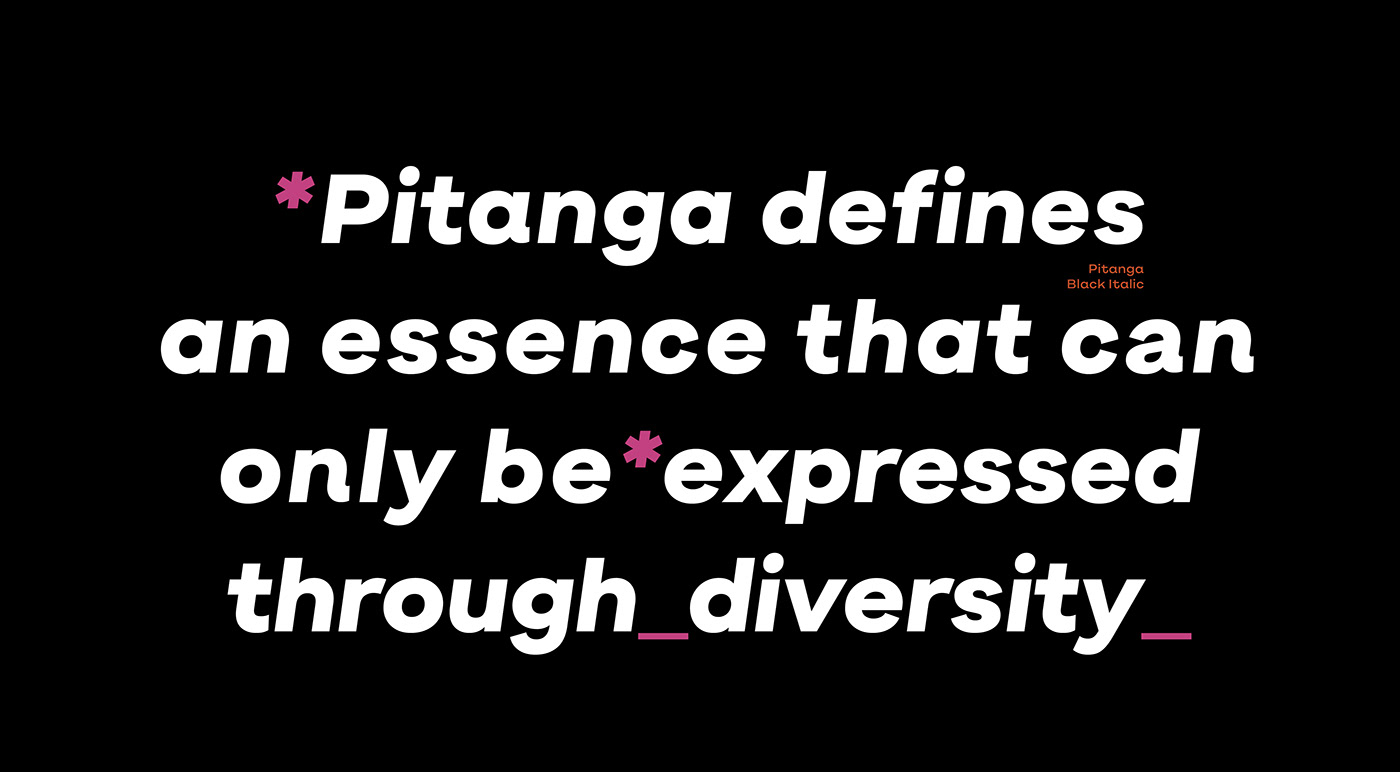
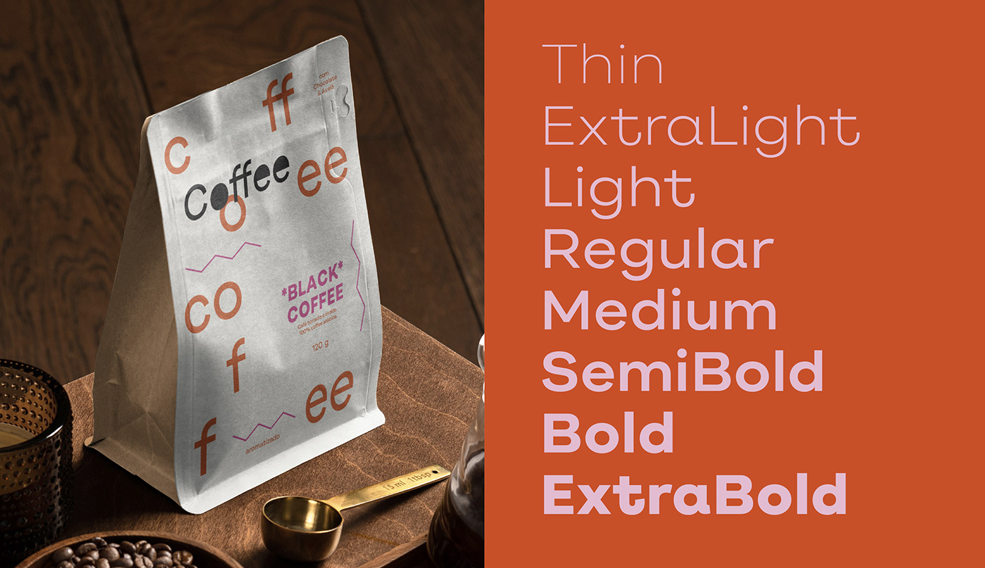
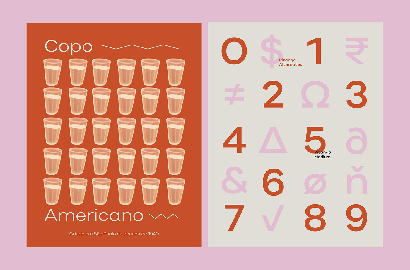
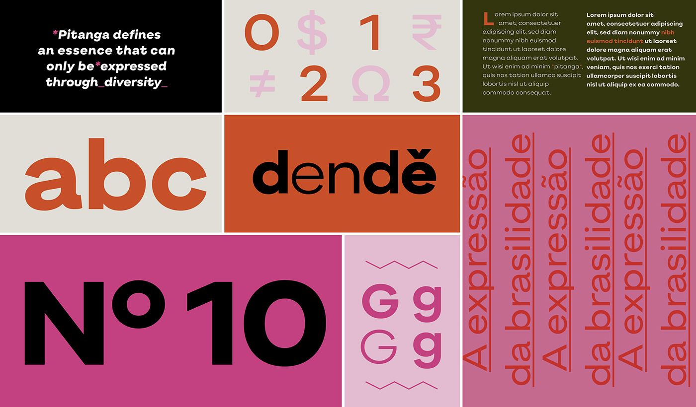
The Pitanga font absorbs the many Brazils that exist to roam freely with light, organic, and loose strokes, creating a sculpted typeface for a diversity of usages. Its designer, Sofia Mohr, created a font that is music to our eyes. It is the form in its most irreverent and uncompromising function, but no less memorable, as in the best sambas.
Like the kid who draws in the beach sand or the kite that takes the skies of Vidigal, Pitanga expands with a calculated rebellion that calls itself flexible. A versatile and expressive font that shows off its curves with confidence and personality. It is Brazil in type form.

Creative Direction & Design: Sofia Mohr
Design Critiques: Fabio Haag, Henrique Beier, Ana Laydner & Eduilson Coan
Engineering: Henrique Beier
Graphic Design: Palp Studio
Illustration: Gabriel Diogo
Copywriting: Thiago Mattar

We are immensely happy with your interest in our small and independent foundry.